
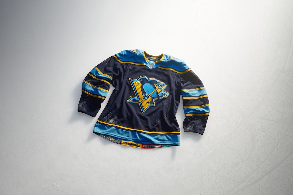
A complete breakdown and report card for all 32 NHL team jersey designs in the new Hometown Remix collection.
The National Hockey League recently unveiled its highly anticipated Hometown Remix jerseys, showcasing unique designs for all 32 teams. These alternate uniforms incorporate local history, regional pride, and distinct team lore into fresh aesthetics.
While fans and analysts alike have strong opinions on the new hockey jerseys, the league-wide release delivers a mix of creative triumphs and questionable aesthetic choices. Reviewers are now handing out comprehensive report cards for every franchise, according to information published by bleache.
From cinematic throwbacks to controversial color schemes, the new collection captures the diverse culture surrounding professional hockey. Organizations took vastly different approaches to represent their local fanbases in this major apparel drop.
Analysing Cinematic And Collegiate NHL Jersey Designs
The Anaheim Ducks delivered a standout release by embracing the movie that inspired their franchise name. Utilizing the classic uniform style from the film The Mighty Ducks, the team paired it with a masked duck crest on the front to capture the original spirit.
Meanwhile, the Boston Bruins took inspiration from local college hockey programs. Featuring a brown and gold palette with block lettering, the design pays homage to collegiate traditions found across the Boston area and the wider New England region.
Buffalo Sabres fans finally received a blue and gold version of the beloved goathead logo. The jersey incorporates electric gold highlights, white stripes, and a subtle electric bolt sabre pattern that directly honors the City of Light flag.
Regional Pride And Arena Tributes In Hockey Apparel
The Calgary Flames honored their home arena during its final season by integrating deep architectural details into their apparel. Designers added texture representing the Saddledome ceiling into the flaming C logo and window patterns on the sleeve stripes.
The Carolina Hurricanes featured their mascot, Stormy, wearing a 1950s varsity sweater and porkpie hat directly on the front crest. Sleeve details include oak leaf patterns celebrating Raleigh as the City of Oaks, alongside architectural nods to the local area.
The Chicago Blackhawks introduced a green sweater that mirrors historic University of North Dakota uniforms. While the green color nods to past St. Patrick's Day specials, the sleeves also incorporate six-pointed stars from the official Chicago flag.
Controversial Color Choices And Mountain Aesthetics
The Colorado Avalanche leaned heavily into their snowy namesake with a crisp white base, icy blue sleeves, and darker mountain tones. Frosted shoulder logos and shimmering silver stripes complete the cold weather aesthetic.
The Columbus Blue Jackets faced a unique challenge due to their team name originating from American Civil War history. Instead of utilizing blue, the organization released a gray jersey based on previous Stadium Series designs, drawing mixed reactions from fans.
The Dallas Stars opted for a white-based aesthetic representing the local nightlife and city skyline. The updated crest and gussied-up sleeve stripes provide a modern look for the Texas franchise.
Frequently Asked Questions
What are the NHL Hometown Remix jerseys?
The NHL Hometown Remix jerseys are a league-wide apparel collection featuring unique uniform designs for all 32 teams, highlighting local history, regional pride, and team culture.
Why did the Anaheim Ducks jersey stand out?
The Anaheim Ducks embraced cinematic history by recreating the iconic uniform style from the movie The Mighty Ducks, paired with a masked duck crest.
How did the Calgary Flames honor their arena?
The Calgary Flames incorporated textures from the Saddledome ceiling and window designs into their logo and sleeve stripes to pay tribute to the arena in its final season.
